Creating custom thumbnails is an important part of elevating your brand and influencing viewers to choose your video out of all of the other options available to them. While a custom thumbnail can’t improve your content, it will play a vital role in helping your already awesome content get noticed!
A Couple Things to Note Before You Start Designing:
First things first- let’s nail down the basics. Here are some sizing and formatting recommendations that YouTube recommends:
- 1280 x 720 pixels is the recommended dimension for YouTube thumbnails
- An aspect ratio of 16:9 is most commonly used
- Must be less than 2MB
- Must be uploaded in one of the following formats: .JPG, .PNG, .GIF, or .BMP
It’s important to remember that your thumbnail will be appearing as a small size in YouTube’s previews but also as a larger picture when it’s embedded in the YouTube player. To ensure that your thumbnail will be clear no matter how it’s presented, it’s important to test out your thumbnail image in different sizes to ensure that it doesn’t become too pixelated.
When it comes to designing high-quality thumbnails, it’s important to keep these aspects in mind:
- Brand Colors
- Large Text
- Obvious Primary Object or Subject
- Minimal Words
- Engaging Design Elements
- Custom Background Images
Contrasting Elements With Bright Backgrounds
Contrast is one of the most important elements to consider when thinking about the clarity of your thumbnail.
High contrast images, meaning images that feature colors that are different from each other (such as black and white), are easily recognizable and grab the viewers attention. Lower contrast images, or images that feature colors that are very similar to each other (such as orange and red), can make it difficult for viewers to decipher the different elements of your thumbnail design.
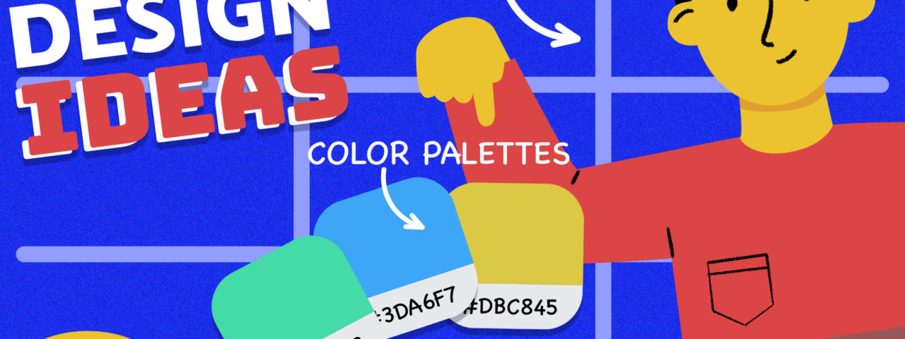
When choosing colors for your thumbnail, many creators opt to go with complimentary colors, or colors that are opposite of each other on the color wheel. Using similar methods when creating your color palette can allow the individual identities of your thumbnail designs shine through.
As a side note- some creators have found greater success using thumbnail images that incorporate the color yellow. Citing that the brightness of the color grabs the attention of their viewers, the videos that feature yellow thumbnails typically see more views. We’d love to put this theory to the test and see if it actually works!
Make Eye Contact With Your Viewers
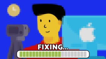
Thumbnails that feature an image of a face are known to build a stronger connection with their viewers. If your potential audience is able to make eye contact with someone featured in your video, they are more prone to be curious about your content and click on your video.
Think of it this way: in a sea of faceless thumbnails, your video is sure to grab someone’s attention if you’re looking right at them!
Don’t Be Afraid to Incorporate Close-Ups
Close-up shots have been proven to be more powerful for your video thumbnail image than wide shots. Are you surprised?
Because your thumbnail image is typically being displayed on a small smartphone screen, it can be difficult for your viewers to see the details of an image if it’s a wide shot of a scene. This small detail might make the viewers skip without putting the effort to make out the content.
Use Actions Shots
Action shots are more likely to make people pause their scrolling to determine what’s happening in the image. The face shown may depict an expression like the person is about to say something. The catch is that the viewer can’t figure out what exactly they want to tell you unless they click to view.
Implement the “Rule of Thirds”
The rule of thirds essentially separates your image into equal four equal squares. Your image will be centered, well-balanced, and easy for the viewer to understand if you place the center of your image at the intersection of those squares.
To implement the rule of thirds within your thumbnail, try to fill up at least two-thirds of the image with your main subject and allow the last third to serve as intentional white space or for important text.
Creating a Visual Identity for Your Brand
It’s important to remain consistent when designing your video thumbnails. Creating a familiar aesthetic for your channel will allow people to instantly recognize your content, making them more likely to click on your videos.
Consider the following elements when creating a visual identity for your brand:
- What font(s) you’re using
- Branding elements such as your logo
- Color palettes and intensity
- Any familiar faces or emojis
Keep in mind that whatever style you choose, it’s important to stick with it so you can consistently work towards building a strong visual identity for your brand.
Need help?
Contact us