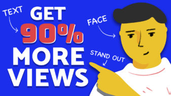
YouTube is more competitive than ever in 2024. With over 500 hours of video uploaded every minute, creating thumbnails that entice viewers to click is crucial. This article will provide 10 eye-catching thumbnail ideas to increase YouTube video clicks and visibility. Implementing these creative and strategic designs can help you stand out on YouTube in 2024.
- Use High-Contrast Text and Colors
Contrasting, complementary colors make the key elements pop. A saturated pink or yellow text on a black background instantly grabs attention. Likewise, white text pops on a vivid red or blue background. The high contrast makes the titles and text eye-catching and easy to read. - Incorporate Emotional Faces
Research shows YouTube thumbnails with faces showing strong emotions get better clickthrough rates. Close-ups that display a personality along with emotional cues like smiles or surprise help viewers relate and click. Choose images that connect with viewers. - Feature Numbers and Lists
Studies reveal YouTube thumbnails with numbers or lists receive more clicks. The reason: these signal to viewers that the video provides step-by-step advice, a roundup, or comparison, all content viewers find valuable. Generate intrigue with headlines like “10 Ways to…” - Layer Transparent Shapes and Lines
Using transparent geometric shapes, diagonal lines, arrows, and other elements layered over your thumbnail images create visual interest. These graphic additions draw attention to the main topic and help reinforce the titles and text. - Use Captivating Call Outs
Pulling out an intriguing, inspiring or surprising 1-4 word call out from your video and featuring it boldly on your thumbnail can entice viewers to click. Use a compelling call out that both captures attention and conveys the emotion and essence of what the video is about. Keeping the call out concise makes it stand out clearly on the thumbnail. - Incorporate Vibrant Graphics
Enhance standard imagery by incorporating colorful shapes and graphics like circles, arrows, speech bubbles or starbursts. These eye-catching embellishments embedded in strategic spots atop images grab attention fast. Just ensure they don’t distract from key titles and text. - Go Minimalist
Sometimes less is more. A minimalist aesthetic with lots of white space and a singular graphic or text element also stops the scroll. The ample negative space around key graphic visuals helps them stand out. - Style with Bold Typography
Big, bold titles grab attention on crowded YouTube feeds. Using thick fonts and enlarging the titles ensure they stay conspicuous even on small mobile screens. Pair bold fonts with high-saturation colors for maximum impact. - Use Custom Thumbnails Thumbnail Specialists
For next-level YouTube thumbnails, enlist a specialized service like CustomThumbnails.com. Their team crafts eye-catching thumbnails tailored to your brand and content using data-backed design principles proven to stop the scroll. - A/B Test Different Options
There is no one-size-fits-all thumbnail. The ideal option depends on your niche, video style and more. Use a service like Custom Thumbnails to create multiple thumbnail options to A/B test and determine the highest performing thumbnail for each video.
Conclusion
Following YouTube thumbnail trends keeps your content competitive and engaging in 2024’s saturated landscape. But beyond applying designs judiciously, continually test thumbnails to determine which drive maximum views for your channel. With a specialist thumbnail creator like CustomThumbnails.com, captivate viewers in 2024 with memorable graphics optimized just for you.
Need help?
Contact us


